Making revenue growth easy for restaurants
Making revenue growth easy for restaurants
Making revenue growth easy for restaurants
Oddle empowers restaurants across the world to capture customer data, build their brand, and grow their business
Oddle empowers restaurants across the world to capture customer data, build their brand, and grow their business
Oddle empowers restaurants across the world to capture customer data, build their brand, and grow their business
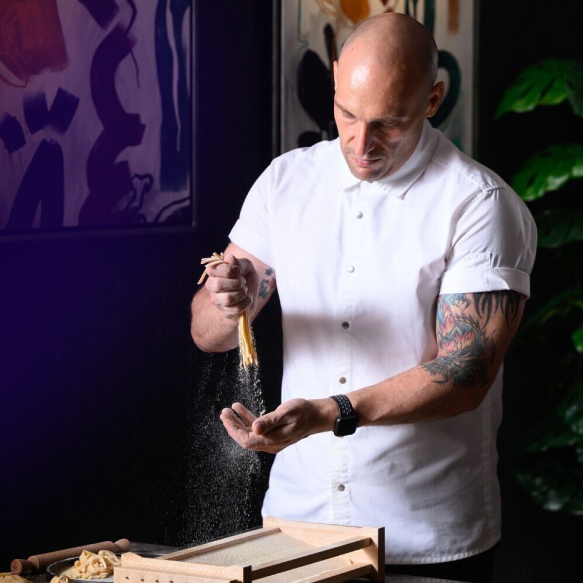
Chicco Pasta Bar
Drew Nocente


Keng Eng Kee
Paul Liew


HJH Maimunah
Mastura


Abundance Restaurant
Yuan Xin


Chicco Pasta Bar
Drew Nocente


Keng Eng Kee
Paul Liew


HJH Maimunah
Mastura


Abundance Restaurant
Yuan Xin


Chicco Pasta Bar
Drew Nocente


Keng Eng Kee
Paul Liew


HJH Maimunah
Mastura


Abundance Restaurant
Yuan Xin


Chicco Pasta Bar
Drew Nocente


Keng Eng Kee
Paul Liew


HJH Maimunah
Mastura


Abundance Restaurant
Yuan Xin


Chicco Pasta Bar
Drew Nocente


Keng Eng Kee
Paul Liew


HJH Maimunah
Mastura


Abundance Restaurant
Yuan Xin


Chicco Pasta Bar
Drew Nocente


Keng Eng Kee
Paul Liew


HJH Maimunah
Mastura


Abundance Restaurant
Yuan Xin


Chicco Pasta Bar
Drew Nocente


Keng Eng Kee
Paul Liew


HJH Maimunah
Mastura


Abundance Restaurant
Yuan Xin


Chicco Pasta Bar
Drew Nocente


Keng Eng Kee
Paul Liew


HJH Maimunah
Mastura


Abundance Restaurant
Yuan Xin


Chicco Pasta Bar
Drew Nocente


Keng Eng Kee
Paul Liew


HJH Maimunah
Matsura


Abundance Restaurant
Yuan Xin


Chicco Pasta Bar
Drew Nocente


Keng Eng Kee
Paul Liew


HJH Maimunah
Matsura


Abundance Restaurant
Yuan Xin


Chicco Pasta Bar
Drew Nocente


Keng Eng Kee
Paul Liew


HJH Maimunah
Matsura


Abundance Restaurant
Yuan Xin


Chicco Pasta Bar
Drew Nocente


Keng Eng Kee
Paul Liew


HJH Maimunah
Matsura


Abundance Restaurant
Yuan Xin


Chicco Pasta Bar
Drew Nocente


Keng Eng Kee
Paul Liew


HJH Maimunah
Matsura


Abundance Restaurant
Yuan Xin


Chicco Pasta Bar
Drew Nocente


Keng Eng Kee
Paul Liew


HJH Maimunah
Matsura


Abundance Restaurant
Yuan Xin


Chicco Pasta Bar
Drew Nocente


Keng Eng Kee
Paul Liew


HJH Maimunah
Matsura


Abundance Restaurant
Yuan Xin


Chicco Pasta Bar
Drew Nocente


Keng Eng Kee
Paul Liew


HJH Maimunah
Matsura


Abundance Restaurant
Yuan Xin

Trusted by 5000+ restaurants across the globe

Trusted by 5000+ restaurants across the globe

Trusted by 5000+ restaurants across the globe

Trusted by 5000+ restaurants across the globe

Growing is as easy as ABC
Acquire, Build, and Convert Your Way to Success
Acquire Customer Data
Capture insights from every reservation, delivery, and dine-in visit to build a powerful customer database
Acquire Customer Data
Capture insights from every reservation, delivery, and dine-in visit to build a powerful customer database
Acquire Customer Data
Capture insights from every reservation, delivery, and dine-in visit to build a powerful customer database
Acquire Customer Data
Capture insights from every reservation, delivery, and dine-in visit to build a powerful customer database
Build Your Brand
Create a seamless online presence that reflects your restaurant’s identity and keeps customers engaged
Build Your Brand
Create a seamless online presence that reflects your restaurant’s identity and keeps customers engaged
Build Your Brand
Create a seamless online presence that reflects your restaurant’s identity and keeps customers engaged
Build Your Brand
Create a seamless online presence that reflects your restaurant’s identity and keeps customers engaged
Convert for Growth
Turn first-time diners into regulars with automated rewards, campaigns, and personalized reminders
Convert for Growth
Turn first-time diners into regulars with automated rewards, campaigns, and personalized reminders
Convert for Growth
Turn first-time diners into regulars with automated rewards, campaigns, and personalized reminders
Convert for Growth
Turn first-time diners into regulars with automated rewards, campaigns, and personalized reminders
Everything you need to grow your revenue
From personalized engagement to seamless operations, we provide everything you need to boost your bottom line
Reservation
Simplify table bookings and grow dine-in sales across all segments
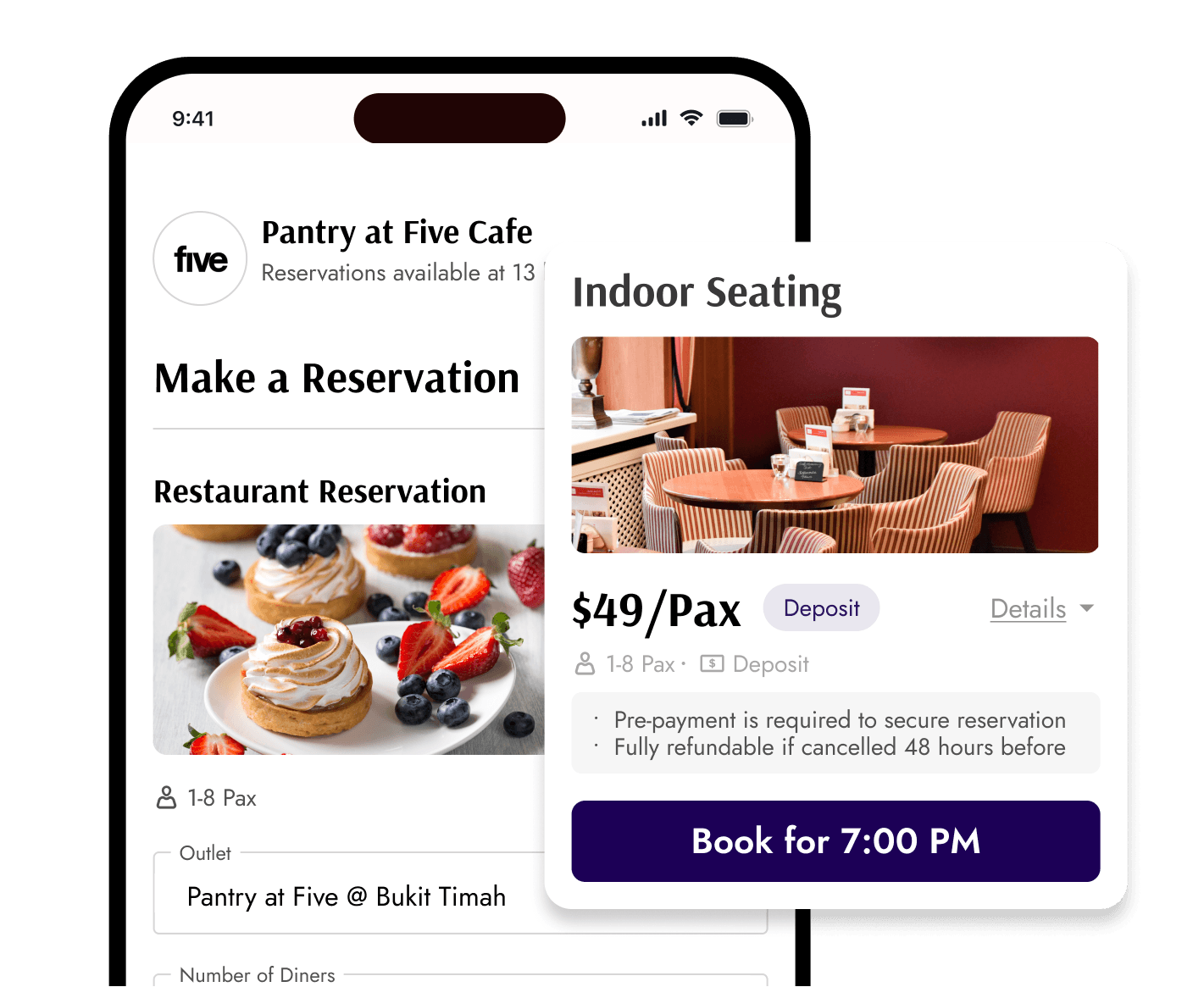


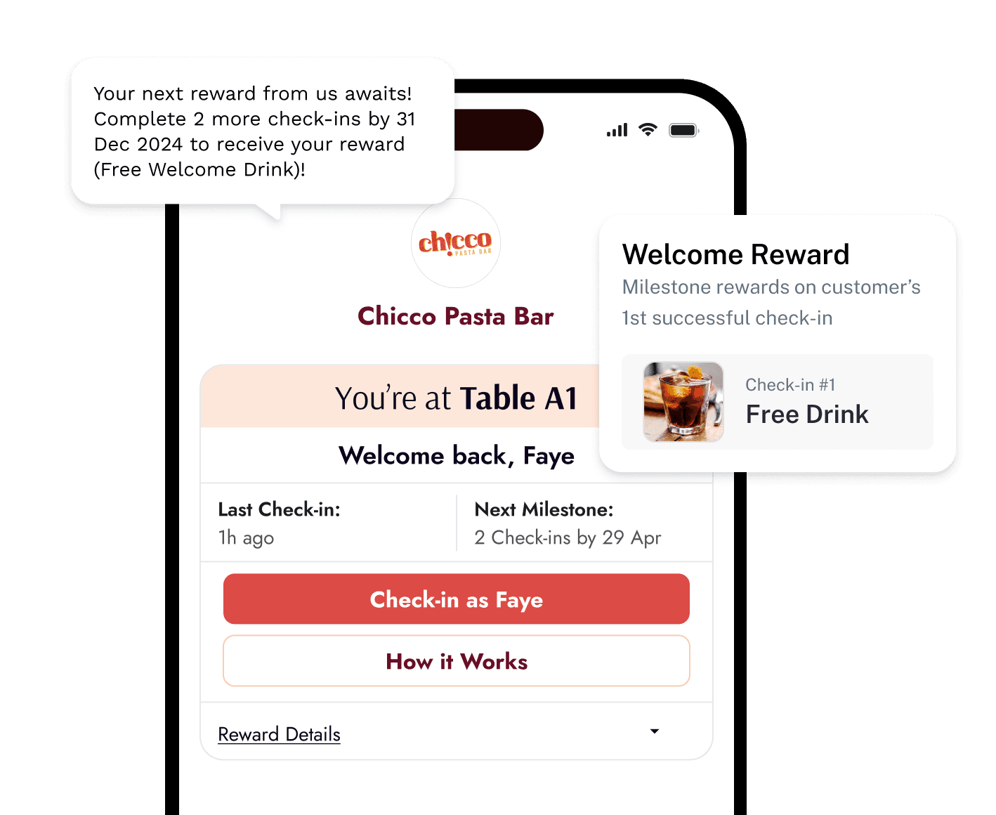
Online Ordering
Boost delivery revenue with a branded online ordering system
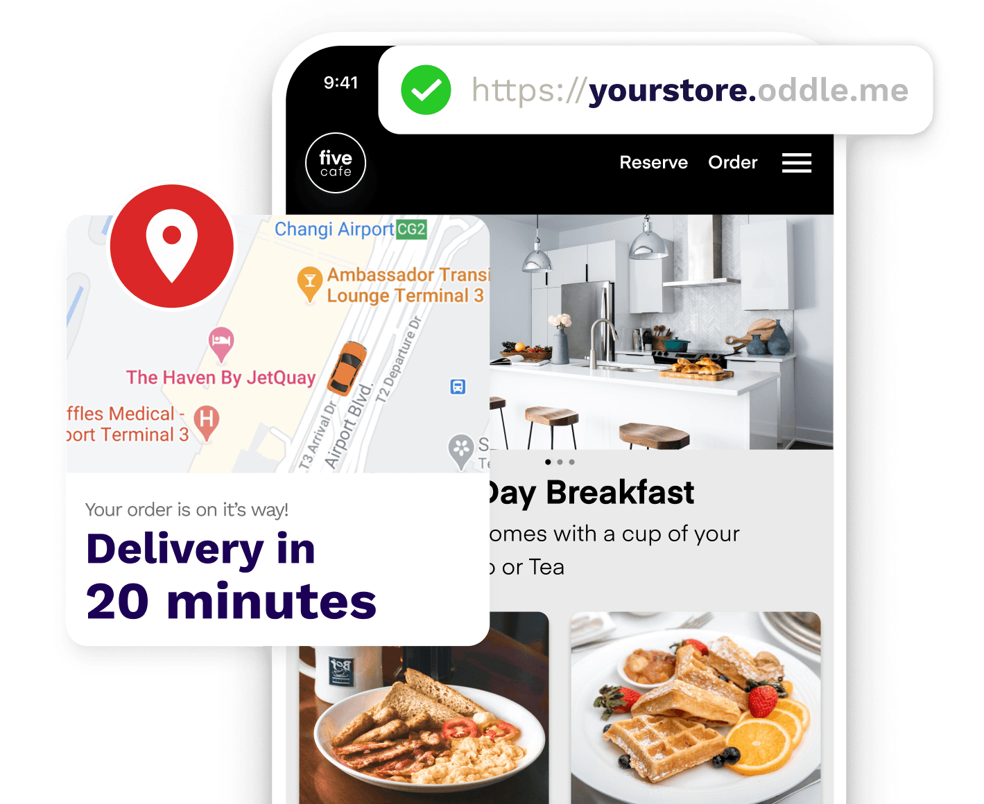


Next-Gen Payment Terminals
Competitive payment processing that turns every transaction into a growth opportunity
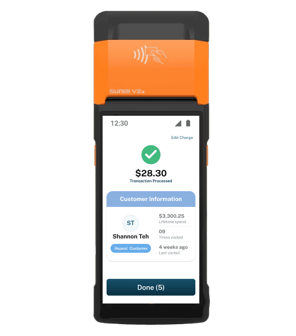


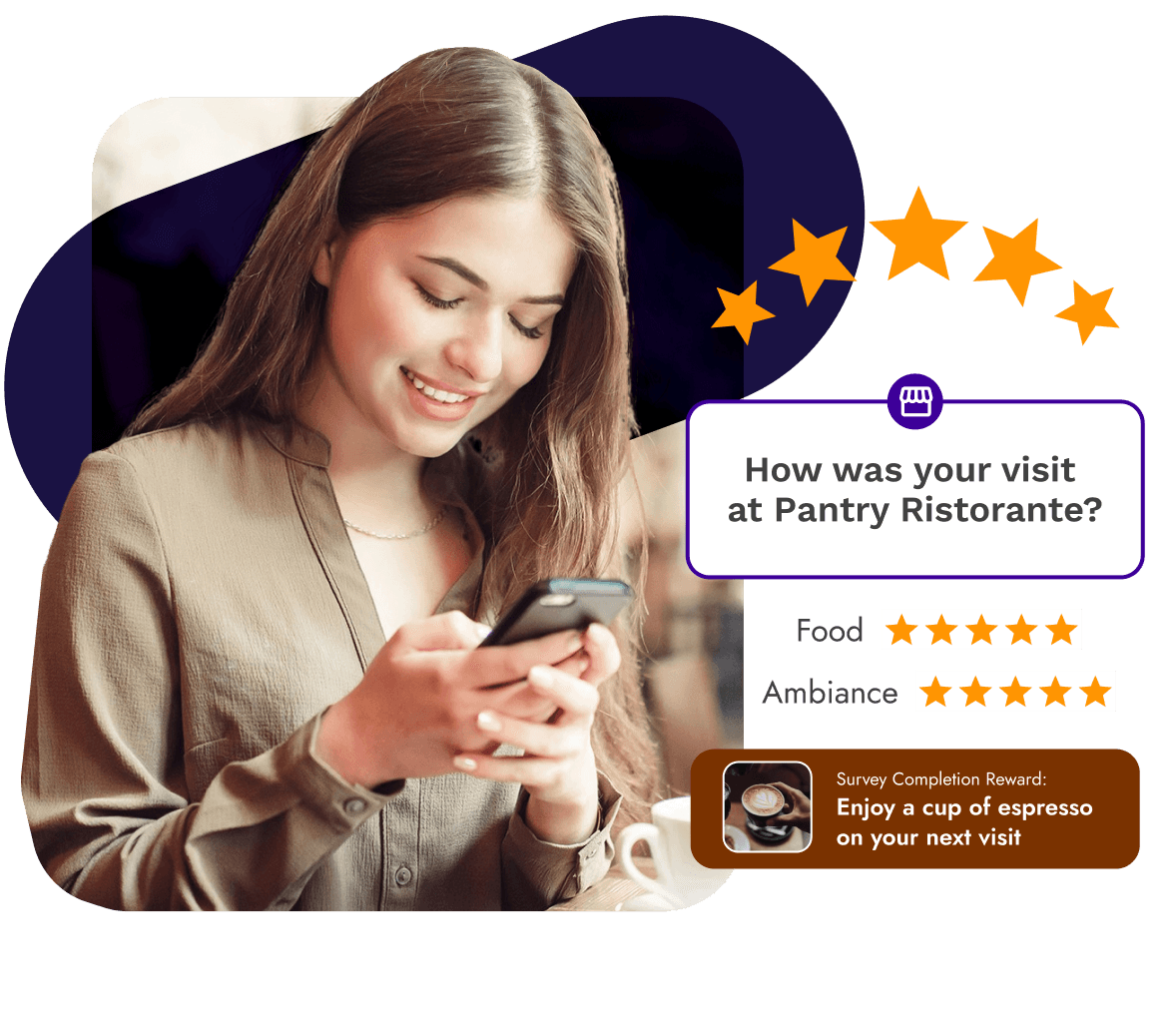
Surveys
Automatically collect feedback and boost your online reputation


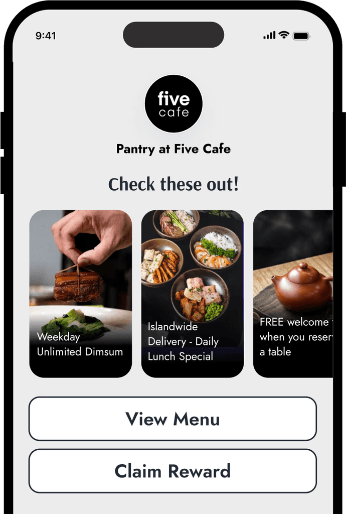
Virtual Lounge
Create a digital space that reflects your menu, promotions, and personality


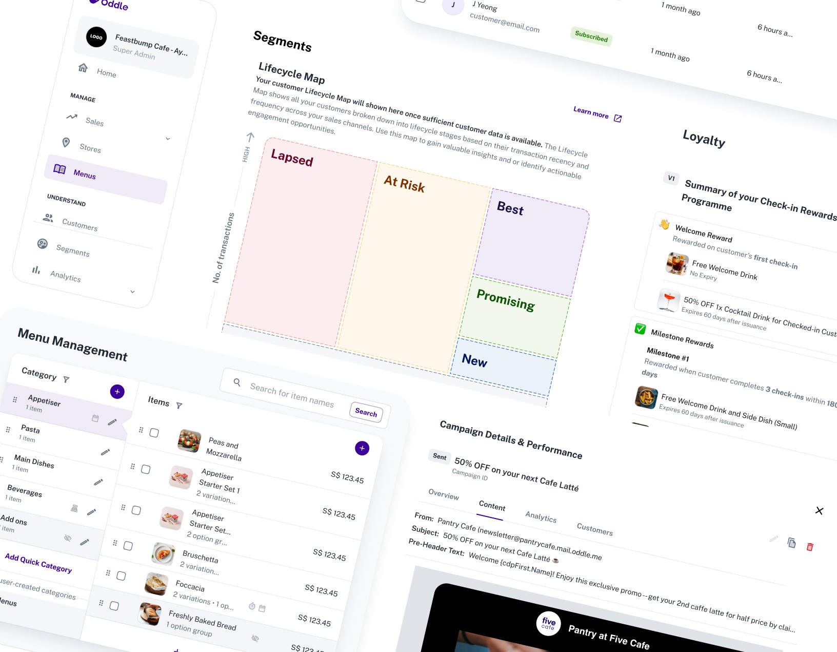
Marketing Engine
Automate campaigns and grow your online reputation effortlessly



Bring it all together with a platform that centralizes customer data and insights


See our free guides on growing your restaurant

Everything you need to get started with a Restaurant Reservation System
See our free guides on growing your restaurant

Everything you need to get started with a Restaurant Reservation System
See our free guides on growing your restaurant

Everything you need to get started with a Restaurant Reservation System
What our customers are saying
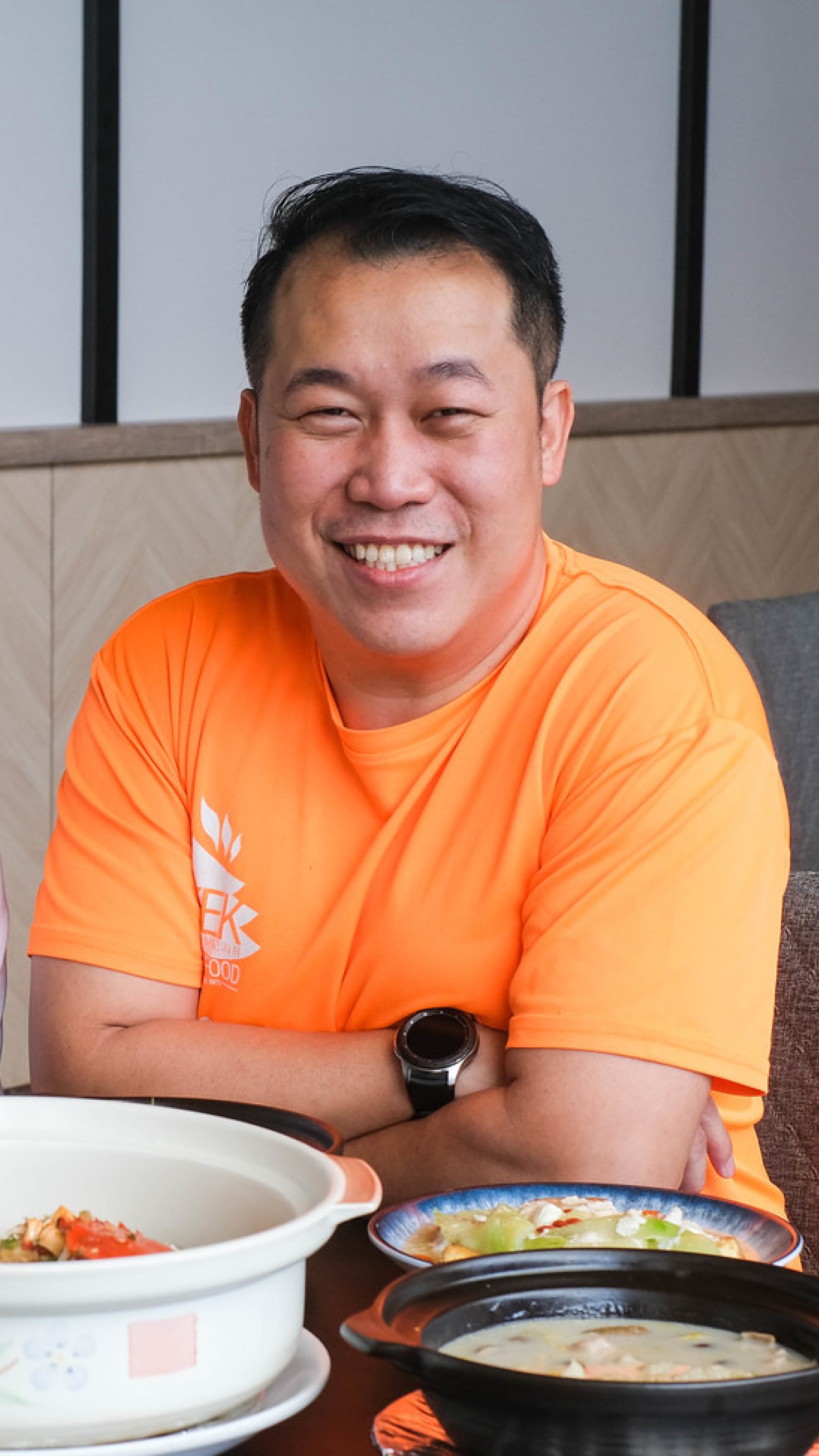
"I grew my delivery sales by 40%. I also discovered room for growth in my weekday lunch sales, and since switching on the engine, my reservation covers for lunch have gone up by 30%."
Paul Liew
Owner, Keng Eng Kee


“I’ve tripled my delivery sales. The extra revenue I’ve made more than pays for Oddle. I hope Oddle keeps making more money from me because it means I’ll be making even more too!”
Yuan Xin
Owner, Abundance


"I grew my delivery sales by 40%. I also discovered room for growth in my weekday lunch sales, and since switching on the engine, my reservation covers for lunch have gone up by 30%."
Paul Liew
Owner, Keng Eng Kee


“I’ve tripled my delivery sales. The extra revenue I’ve made more than pays for Oddle. I hope Oddle keeps making more money from me because it means I’ll be making even more too!”
Yuan Xin
Owner, Abundance


"I grew my delivery sales by 40%. I also discovered room for growth in my weekday lunch sales, and since switching on the engine, my reservation covers for lunch have gone up by 30%."
Paul Liew
Owner, Keng Eng Kee


“I’ve tripled my delivery sales. The extra revenue I’ve made more than pays for Oddle. I hope Oddle keeps making more money from me because it means I’ll be making even more too!”
Yuan Xin
Owner, Abundance


"I grew my delivery sales by 40%. I also discovered room for growth in my weekday lunch sales, and since switching on the engine, my reservation covers for lunch have gone up by 30%."
Paul Liew
Owner, Keng Eng Kee


“I’ve tripled my delivery sales. The extra revenue I’ve made more than pays for Oddle. I hope Oddle keeps making more money from me because it means I’ll be making even more too!”
Yuan Xin
Owner, Abundance
What our customers are saying


"I grew my delivery sales by 40%. I also discovered room for growth in my weekday lunch sales, and since switching on the engine, my reservation covers for lunch have gone up by 30%."
Paul Liew
Owner, Keng Eng Kee


“I’ve tripled my delivery sales. The extra revenue I’ve made more than pays for Oddle. I hope Oddle keeps making more money from me because it means I’ll be making even more too!”
Yuan Xin
Owner, Abundance


"I grew my delivery sales by 40%. I also discovered room for growth in my weekday lunch sales, and since switching on the engine, my reservation covers for lunch have gone up by 30%."
Paul Liew
Owner, Keng Eng Kee


“I’ve tripled my delivery sales. The extra revenue I’ve made more than pays for Oddle. I hope Oddle keeps making more money from me because it means I’ll be making even more too!”
Yuan Xin
Owner, Abundance


"I grew my delivery sales by 40%. I also discovered room for growth in my weekday lunch sales, and since switching on the engine, my reservation covers for lunch have gone up by 30%."
Paul Liew
Owner, Keng Eng Kee


“I’ve tripled my delivery sales. The extra revenue I’ve made more than pays for Oddle. I hope Oddle keeps making more money from me because it means I’ll be making even more too!”
Yuan Xin
Owner, Abundance


"I grew my delivery sales by 40%. I also discovered room for growth in my weekday lunch sales, and since switching on the engine, my reservation covers for lunch have gone up by 30%."
Paul Liew
Owner, Keng Eng Kee


“I’ve tripled my delivery sales. The extra revenue I’ve made more than pays for Oddle. I hope Oddle keeps making more money from me because it means I’ll be making even more too!”
Yuan Xin
Owner, Abundance
What our customers are saying


"I grew my delivery sales by 40%. I also discovered room for growth in my weekday lunch sales, and since switching on the engine, my reservation covers for lunch have gone up by 30%."
Paul Liew
Owner, Keng Eng Kee


“I’ve tripled my delivery sales. The extra revenue I’ve made more than pays for Oddle. I hope Oddle keeps making more money from me because it means I’ll be making even more too!”
Yuan Xin
Owner, Abundance


"I grew my delivery sales by 40%. I also discovered room for growth in my weekday lunch sales, and since switching on the engine, my reservation covers for lunch have gone up by 30%."
Paul Liew
Owner, Keng Eng Kee


“I’ve tripled my delivery sales. The extra revenue I’ve made more than pays for Oddle. I hope Oddle keeps making more money from me because it means I’ll be making even more too!”
Yuan Xin
Owner, Abundance


"I grew my delivery sales by 40%. I also discovered room for growth in my weekday lunch sales, and since switching on the engine, my reservation covers for lunch have gone up by 30%."
Paul Liew
Owner, Keng Eng Kee


“I’ve tripled my delivery sales. The extra revenue I’ve made more than pays for Oddle. I hope Oddle keeps making more money from me because it means I’ll be making even more too!”
Yuan Xin
Owner, Abundance


"I grew my delivery sales by 40%. I also discovered room for growth in my weekday lunch sales, and since switching on the engine, my reservation covers for lunch have gone up by 30%."
Paul Liew
Owner, Keng Eng Kee


“I’ve tripled my delivery sales. The extra revenue I’ve made more than pays for Oddle. I hope Oddle keeps making more money from me because it means I’ll be making even more too!”
Yuan Xin
Owner, Abundance
What our customers are saying


"I grew my delivery sales by 40%. I also discovered room for growth in my weekday lunch sales, and since switching on the engine, my reservation covers for lunch have gone up by 30%."
Paul Liew
Owner, Keng Eng Kee


“I’ve tripled my delivery sales. The extra revenue I’ve made more than pays for Oddle. I hope Oddle keeps making more money from me because it means I’ll be making even more too!”
Yuan Xin
Owner, Abundance


"I grew my delivery sales by 40%. I also discovered room for growth in my weekday lunch sales, and since switching on the engine, my reservation covers for lunch have gone up by 30%."
Paul Liew
Owner, Keng Eng Kee


“I’ve tripled my delivery sales. The extra revenue I’ve made more than pays for Oddle. I hope Oddle keeps making more money from me because it means I’ll be making even more too!”
Yuan Xin
Owner, Abundance


"I grew my delivery sales by 40%. I also discovered room for growth in my weekday lunch sales, and since switching on the engine, my reservation covers for lunch have gone up by 30%."
Paul Liew
Owner, Keng Eng Kee


“I’ve tripled my delivery sales. The extra revenue I’ve made more than pays for Oddle. I hope Oddle keeps making more money from me because it means I’ll be making even more too!”
Yuan Xin
Owner, Abundance


"I grew my delivery sales by 40%. I also discovered room for growth in my weekday lunch sales, and since switching on the engine, my reservation covers for lunch have gone up by 30%."
Paul Liew
Owner, Keng Eng Kee


“I’ve tripled my delivery sales. The extra revenue I’ve made more than pays for Oddle. I hope Oddle keeps making more money from me because it means I’ll be making even more too!”
Yuan Xin
Owner, Abundance
Pay as you scale
No long-term commitments, no hidden costs—just straightforward, performance-based pricing that supports your business growth
Pay as you scale
No long-term commitments, no hidden costs—just straightforward, performance-based pricing that supports your business growth
Pay as you scale
No long-term commitments, no hidden costs—just straightforward, performance-based pricing that supports your business growth


